
Marketplace UX Re-design

Project overview.
The product is a fashion-focused e-commerce platform supporting small and mid-sized brands. The redesign aimed to increase user engagement, improve personalization, and boost overall conversion. It included a full overhaul of the homepage, checkout flow, brand discovery experience, and key content modules like influencer sections and sustainability impact banners.
My Role & Collaboration:
As the sole UI/UX Designer and Business Analyst on the project, I owned the full design cycle—from discovery to delivery. My responsibilities included:
Leading stakeholder interviews and gathering business requirements
Translating insights from Google Analytics and user feedback into actionable UX goals
Prioritizing redesign tasks and roadmap with the team
Conducting UX and UI audits to identify key user pain points
Redesigning core flows and interfaces (homepage, checkout, product detail, brand navigation, etc.)
Creating a modular homepage experience to enable A/B testing of personalized content and offers
Implementing promo mechanics and gamification features to boost engagement and loyalty
Simplifying the checkout experience using autofill logic and progressive data entry
Adding a “Fulfilled by Baza” badge to increase trust and encourage larger orders
Launching a sustainability module with real-time impact stats to reinforce brand values
Testing, validating, and polishing designs post-handoff to ensure visual and functional accuracy
1 year
Duration:
Tools:
Figma / Jira
15+
Team:
The challenges.
The platform struggled with poor UX, inefficient user flows, and low engagement. There was no personalization, inconsistent layout structure, and unclear product categorization. The checkout process was long and manual, leading to high drop-off rates.
As the designer and business analyst, I initiated a full audit, ran stakeholder interviews, analyzed competitors, and led user surveys to identify key friction points and business opportunities.


Aligning Business & UX: Discovery & Research
To understand the platform’s issues and user pain points, I led the discovery phase across three key tracks:
I conducted a kickoff session with key stakeholders to gather business goals and pain points. We mapped and prioritized issues based on impact and urgency — this helped define a shared vision early on and set the foundation for UX strategy — visualized with a pain-point matrix on the next slide
Stakeholder Alignment:


Competitor & Analytics Review:
To benchmark our product, I analyzed both direct and indirect competitors:
Direct: Faire, Fashion Go, ThredUp
Indirect: Cider, The RealReal, Etsy
This helped identify gaps in product discoverability, personalization, and trust signals.
Since I didn’t have direct access to analytics tools, I collaborated with the marketing team to obtain metrics like bounce rates and drop-off points — these insights shaped our design hypotheses.

User Feedback Collection:
Due to budget constraints, we decided not to run user interviews and instead conducted a structured UX survey — a more accessible, scalable format that still allowed us to gather valuable feedback.
Together with a stakeholder, we collaborated with the internal Marketing team to help us reach users.
We started with a targeted user segmentation, identifying two core groups:
– Business Buyers (e.g., boutique owners, resellers)
– Regular Consumers (e.g., DIY shoppers, family collaborators)

Based on this segmentation, we selected users who had been active on the platform in the past 6 months and had not participated in similar research recently — to ensure relevant and unbiased responses.
Once the user sample was defined, we launched a tailored UX survey for each group, focusing on key areas of the platform: Homepage, PDP, Checkout, Navigation, and Trust.


Aligning Business & UX Priorities
After conducting stakeholder alignment workshops, we identified initial platform issues and organized them into a pain-point matrix. However, to ensure user-centricity, we later complemented these insights with findings from UX surveys and value–pain–effort analysis across two core user groups: Business Buyers and Consumers


Home Page for B2B and B2C customers
🔴 1. One-size-fits-all homepage
Problem: Same landing page for B2B and B2C → no one feels like they’re in the right place.
Pain: Business buyers don’t see wholesale terms, consumers don’t see lifestyle content.

— Old version
🔴 2. No personalization
Problem: Everyone sees the same content, no adaptation to purchase history.
Pain: “I buy XL tees monthly — show me this upfront.”
🔴 3. Generic hero/banner
Problem: "Shop Smart" says nothing specific.
Pain: No trust, no personalization, no clear CTA.
UX flaw: Blurry messaging, poor contrast.
🔴 4. No segmentation by collections or purpose
Problem: Just “featured products” — no reason why these are highlighted.
Pain: Users can’t easily find relevant sizes, colors, or styles.
🔴 5. Weak brand trust
Problem: Banners feel like ads, not trusted B2B content.
Pain: Unclear who the seller is, what the guarantees are, or how shipping works.
🔴 6. No user feedback/social proof
Problem: No reviews, likes, or customer photos.
Pain: Buyers don’t feel part of a community.
🔴 7. No flexible layout or testing options
Problem: Static content, no modular system.
Pain: Stakeholders can’t A/B test, swap banners, or tweak CTAs dynamically.
🔴 9. No fulfillment/shipping clarity
Problem: No info on who handles packaging or delivery.
Pain: Business buyers need to know — who’s packing, when it arrives, payment terms.
🔴 10. Lack of focus on brand discovery
Problem: Brand logos appear too late or feel secondary.
Pain: Business buyers want to see trusted brands upfront.
Home Page for B2B customers
🔵 1. Segmentation for B2B
What we did: Created a dedicated homepage version for business buyers (wholesale focus).
Why: Old site treated B2B and B2C the same → no one felt aligned. Now bulk deals, brand discovery, and B2B perks are front and center.

— New version
🔵 2. Personalization for business users
What we did: Implemented multi-layered personalization across the homepage: dynamic greeting by name (e.g., "Welcome back, Kevin"), tailored banners with relevant wholesale offers, and product recommendations based on past purchases.
Why: This creates an immediate sense of relevance and trust. Buyers see familiar brands they reorder often, feel recognized, and are more likely to engage.
🔵 3. Clear hero messaging & trust signals
What we did: Replaced generic banners with “20% OFF your first bulk order” and verified seller icons.
Why: Business buyers need clear value props and immediate trust signals. CTA is stronger and context-specific.
🔵 4. Bulk-centric product categorization
What we did: Introduced “Bulk Deals from Verified Brands” and “Pre-packed Bundles” sections.
Why: Old site mixed product types. Now, it's easy to spot wholesale offers, bundles, and MOQs.
🔵 5. Modular layout with flexible blocks
What we did: Implemented a modular system for A/B testing (e.g., repositioning banners, swapping CTAs).
Why: Stakeholders can iterate, optimize performance, and tailor offers dynamically.
🔵 6. Stronger brand visibility
What we did: Elevated brands upfront with logos and trust badges (“Verified brand”).
Why: Business buyers prioritize known suppliers. This improves discovery and trust.
🔵 7. Fulfillment clarity
What we did: Added “Fulfilled by Brizz” badges and a dedicated CTA block explaining shipping and bulk quote options.
Why: Buyers now know who’s handling logistics, boosting confidence in the process.
🔵 8. Social proof & community
What we did: Injected customer reviews, reorder data, and referral programs (“Trusted by 40,000+ customers”).
Why: Builds trust, shows real engagement. Old site lacked this entirely.
🔵 9. Consistent, business-friendly visual language
What we did: Shifted to deeper olive backgrounds, sharper typography, and restrained use of accent colors.
Why: Adds professionalism and feels aligned with B2B expectations, but still retains brand identity.
🔵 10. Tailored final CTA (footer)
What we did: Added “Need a custom bulk quote?” with “Contact Sales” option.
Why: Business buyers often need custom negotiations — now there’s a clear path.

Mobile UX improvements:
Applied best practices: large tap targets, readable fonts, fast loading.
Added horizontal category shortcuts for faster access to key sections (Bundles, Fulfilled by Brizz).
Focus: minimize navigation time, boost engagement for business users on mobile.
Summary Impact:
→ Bounce rate ↓ 48% → 41%
→ Product clicks ↑ +19%
→ Avg. session time ↑ +12s
→ Buyers report “more personal and easier to explore”
Home Page for B2C customers
Why mobile?
In the previous section, I showcased the web experience for B2B buyers. Here, I focus on B2C mobile, highlighting my ability to adapt layouts and flows for different devices and audiences.
🔵 1. Segmentation for B2C
What we did:
Created a dedicated mobile homepage for consumers, emphasizing collections, categories, and personal lifestyle content.
Why:
The old homepage was one-size-fits-all. B2C users wanted seasonal inspiration, outfit ideas, and fast category access, now they have it.

— New version
🔵 2. Mobile-first navigation & discovery
What we did:
Added quick-access pills (e.g., Festival Ready, Romantic, Sporty) and category tiles for faster product discovery on mobile.
Why:
B2C shoppers browse on the go. Quick, visual navigation reduces friction and helps users find relevant items faster.
🔵 3. Personalized banners & recommendations
What we did:
Introduced personalized hero banners (e.g., "Welcome back, Anna!") and product feeds like Picked Just for You and Last Few Left.
Why:
Personalization increases engagement. Users feel seen and are more likely to explore.
🔵 4. Trust signals & social proof
What we did:
Integrated reviews, user photos, and social media highlights (e.g., What people are saying about us section).
Why:
B2C buyers rely on peer validation. This builds credibility and reduces hesitation.
🔵 5. Sustainability callout
What we did:
Included a sustainability impact section (300K products given a second life), optimized for mobile.
Why:
B2C shoppers care about eco-friendly shopping. This reinforces brand values.

Summary Impact:
Bounce rate ↓ 47% → 39%
→ Improved mobile engagement due to personalized content and faster navigation.Product clicks ↑ +23%
→ Users interacted more with seasonal collections and quick-access categories.Avg. session time ↑ +18 seconds
→ Longer browsing sessions from targeted recommendations and social proof.User feedback:
“It feels like shopping on Instagram — fast, visual, and fun.”
Brand Card Redesign: From Lifestyle to Clarity
Why it mattered?
The old brand cards lacked clarity and product context. Buyers, especially B2B, struggled to understand what each brand offered at a glance, slowing decision-making and reducing engagement.


🔵 1. Initial lifestyle focus (Iterations 1-2)
What we did:
Started with lifestyle photos to convey the brand’s personality and mood.
Why it didn’t work:
Feedback from buyers and marketing showed these versions missed core product context.
Buyers felt uncertain about what Cider actually sold.
The mood was clear, but there was no product range visibility, which wholesale buyers needed.
🔵 2. Logo-centric & heritage approach (Iterations 3-4)
What we did:
Tried logo-centered designs (minimalist) and heritage badges for trust.
Why it didn’t work:
Too sterile or too intricate.
Buyers found them impersonal or overwhelming for quick scanning.
No emotional connection and still no clear product snapshot.
🔵 3. Product-first grid (Iteration 5 - Approved)
What we did:
Shifted to a product grid layout, showcasing diverse product categories upfront. Added:
Verified Supplier badge
Rating score
Short, clear brand positioning statement
Why it worked:
Buyers could immediately assess the brand’s offering.
Increased trust and relevance in testing.
Balanced emotional engagement (visual style) with practical clarity (product range).
Summary Impact:
Click-through rate grew from 4.8% to 6.1%,
Average time on the brand page increased by 4 seconds
Users reported that the new layout helped them “instantly understand what the brand is about.”
Shopping Bag & Checkout Redesign
🔴 1. Overwhelming, cluttered shopping bag
Problem:
The original shopping bag had too much information packed into one space: product specs, variants, MOQ progress bars, upsell blocks, and a complex order summary. The UX felt heavy and confusing.
Pain:
Buyers struggled to quickly review their order, leading to friction and drop-offs, especially on mobile. Business buyers (B2B) were unclear on MOQ status, and consumers (B2C) felt overwhelmed by product details irrelevant to them.
UX flaw:
Minimal brand differentiation, weak trust signals, and dense data grids made the experience transactional and tedious

— Old version
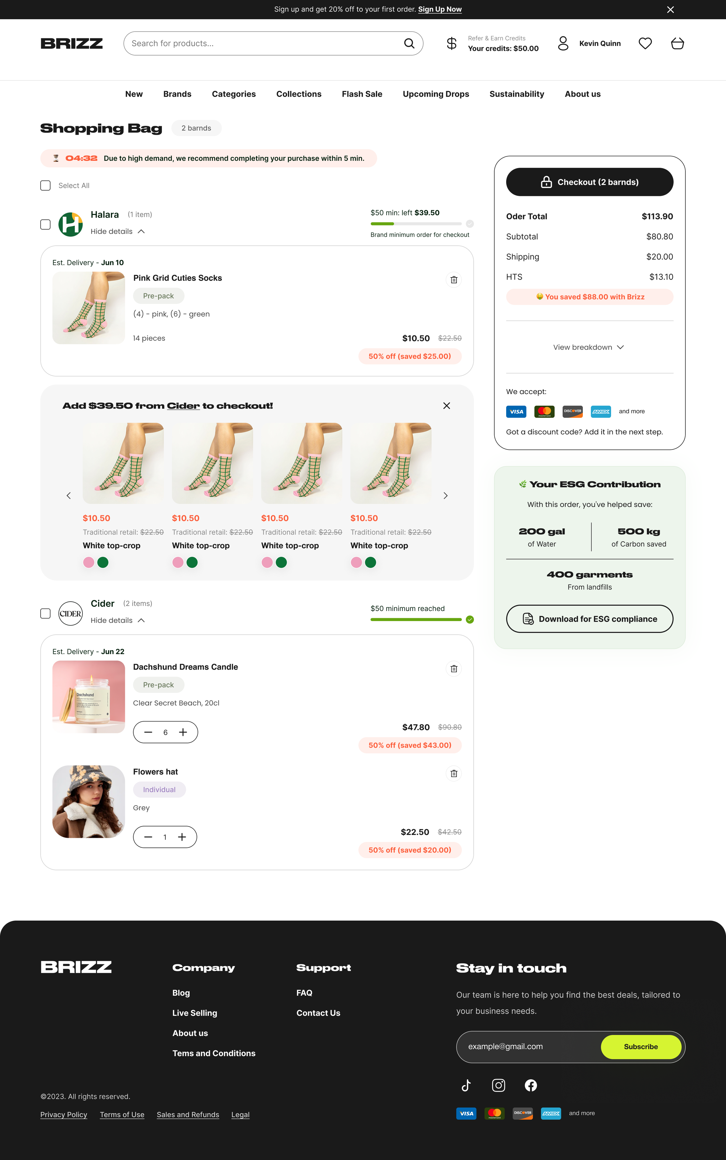


— New version
🔵 1. First redesign — clarity & transparency
What we did:
Cleaned up the shopping bag UI to focus on key information: product, price, discount, MOQ progress bar.
Simplified the order summary with clearer cost breakdowns (subtotal, shipping, taxes).
Introduced a minimal, clean design system aligned with Brizz’s branding.
Enhanced mobile layout for ease of use.
Why:
We aimed to reduce friction and cognitive load. By focusing on clarity and transparency, users could confidently proceed without feeling overwhelmed.
Impact:
This iteration slightly improved conversion rates, thanks to better readability, reduced friction, and clearer trust signals.
🔵 2. Business boost — Fulfilled by Brizz feature
What we did:
To further drive conversion, the business introduced the Fulfilled by Brizz model (orders packed and shipped by Brizz).
I integrated this into the shopping bag UX by:
Adding a free shipping progress bar for eligible items.
Clearly labeling which brands are Fulfilled by Brizz and which are shipped directly by sellers.
Showcasing trust icons and concise messages like “You’re $25 away from free shipping + fulfillment by Brizz.”
Why:
This gave users more confidence and incentives to consolidate their orders under Brizz’s fulfillment for faster, trusted delivery.
Impact:
After implementing this, we saw a further uplift in conversion rates. Users responded positively to the clearer delivery expectations and fulfillment trust.
🔵 3. ESG Contribution for B2B buyers
What we did:
Introduced an ESG Contribution summary for B2B buyers, showing how their purchase contributed to sustainability goals (e.g., water saved, carbon reduced, garments diverted from landfills).
Added an export function for accounting purposes, allowing downloads in PDF and CSV formats.
Why:
B2B buyers often require sustainability documentation for internal reporting. This small feature improved the shopping experience by addressing a specific business need.
Impact:
Improved buyer satisfaction and engagement, especially for sustainability-conscious businesses.

🔵 4. Checkout flow migration — ShopPay
Old flow problem:
Previously, the checkout was a manual, custom-built flow with multiple steps (billing info, shipping, taxes, payment) that required repeated data entry. It was slow and cumbersome, leading to significant drop-off rates.
What we did:
Instead of rebuilding from scratch, we integrated ShopPay as the checkout solution.
Why:
ShopPay is trusted, fast, and familiar to many users.
Reduced friction with pre-filled details, faster payment processing, and strong brand trust.
Impact:
Checkout speed significantly improved and conversion rates increased due to the trust and efficiency of ShopPay.
Mobile Experience
Why mobile?
Alongside the desktop redesign, we optimized the shopping bag for mobile to ensure a seamless, fast, and intuitive checkout flow across devices. For B2B buyers working on the go, clarity and speed were key.
🔹 1. Sticky Checkout & Summary
What we did:
Added a sticky checkout button with a compact order summary that stays visible as users scroll through their cart.
Why:
Mobile users shouldn’t have to scroll endlessly to complete their purchase. This makes checkout quick and accessible at all times.
🔹 2. Expandable Summary Modal
What we did:
Integrated a slide-up modal for detailed order breakdown (subtotal, shipping, HTS), keeping the main view clean.
Why:
This keeps the interface minimal and focused while offering quick access to key details when needed.
🔹 3. Fulfilled by Brizz adaptation
What we did:
Tailored the Fulfilled by Brizz logic (free shipping, MOQ progress bars) for mobile screens, ensuring clear visibility without crowding the interface.
Why:
B2B buyers need to track shipping eligibility and minimum order thresholds easily, even on mobile.
🔹 4. ESG Contribution Export (for B2B)
What we did:
Designed a mobile-friendly export screen for ESG Contribution reports in PDF or CSV.
Why:
This allows B2B buyers to download sustainability reports directly from their phone — adding convenience and value.

After redesigning the shopping bag and checkout flow, and introducing the Fulfilled by Brizz feature:
Average Order Value (AOV) doubled from $25 → $50
New customer conversion rate grew from 2% → 4%
These improvements boosted trust, clarified shipping terms, and streamlined the purchase process.
Note >>>
The PDP (Product Detail Page) redesign is currently being recreated by me for portfolio purposes due to NDA restrictions.
Meanwhile, let’s move on to the Sustainable Mission page.
What we did:
Designed a dedicated Sustainability Mission page to explain Brizz’s environmental initiatives and goals.
Added impact metrics (water saved, carbon reduced, garments diverted from landfills) to PDP and checkout pages.
Provided options to download ESG reports (CSV, PDF) for B2B buyers to meet compliance needs.
Focused on clear, digestible visuals and stats to avoid overwhelming users.
Why:
Sustainability was a key brand pillar but previously hidden. We surfaced this information to build trust with both B2B and B2C users, helping justify product value and support buyer decisions.
Impact:
Improved user trust and engagement, especially for B2B buyers needing ESG data. Helped position Brizz as a responsible, transparent marketplace.
Educating Users on Our Sustainable Mission

Key Learnings
Balancing UX and business analysis was challenging but rewarding — it helped me connect user needs with real business goals.
More users in testing ≠ better insights. Large-scale testing can be expensive and not always meaningful.
Best practices aren't always effective in e-commerce projects. What works elsewhere can hurt performance in a specific context.
A brand needs a clear story. Users engage more when they understand what a brand stands for.
E-commerce must stay flexible. Every section should be modular and ready for A/B testing at any time.
No UX without analytics.Tools like HotJar should be integrated early to uncover user behavior and save time on research.
Other cases where design met strategy
A few more stories where design helped strategy land right.

